

HSE Art and Design School Takes First Place in World Brand Design Society Ranking

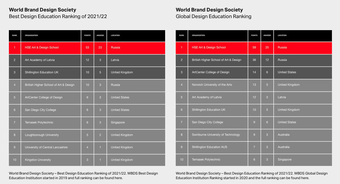
In 2021/22, the World Brand Design Society (WBDS) announced the results of their competition programme. According to the selection and voting results on the award website, HSE Art and Design School has topped the Global Ranking and become the educational institution of the year. In total, students from the HSE Art and Design School scored 53 points and won 22 individual awards: 2 Gold, 6 Silver, 11 Bronze and 3 Honorable Mentions by the jury.
The World Brand Design Society (WBDS) regularly selects the most impressive projects from the pool of work they receive for posting on the official website, and at the end of each year WBDS determines and awards the leaders among world universities.
This article features all the winning projects by students and graduates of the programmes in ‘Communication Design’ and ‘Art Direction’.
Leonid Slavin, curator of the Master's programme in Art Direction said ‘The WBDS jury list includes representatives of Pentagram, Pearlfisher, Turner Duckworth and many other famous agencies that make up the modern visual communications market. These people understand what the world expects from the creative industry: fresh and original concepts, accurate visual metaphors, convincing technical implementation, and the winning projects feature all these things.’
Golden Awards
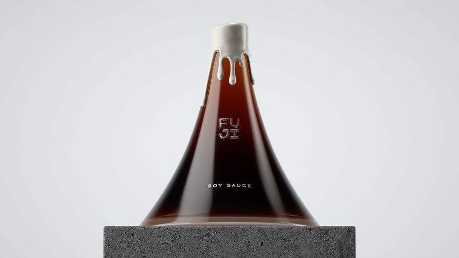
Evgenia Kudrinskaya
Packaging Design Student Concept for FUJI Premium Soy Sauce
Soy sauce is a symbol of Japanese culture. The shape of the bottle emphasizes the origins of soy sauce and makes a reference to one of the most sacred places in Japan – the Mt Fuji volcano. The sauce is presented in two sku – classic soy sauce (dormant volcano) and hot soy sauce (erupting volcano). The sauce has a special stand (the foot of a volcano) that can be used as a gravy boat.
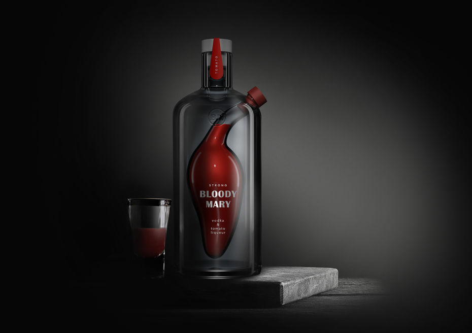
Tanya Dunaeva
Bloody Mary Student Concept Packaging Design
“Bloody Mary” is a classic cocktail made from vodka and tomato juice.
The concept of the gift packaging for “Bloody Mary” premium vodka is based on the cocktail “Bloody Mary”, combining two drinks in the same container. The first is vodka, but instead of the classic tomato juice, tomato liqueur is used. There are two more drinks in the series - “Bloody Margot” with cherry liqueur and “Bloody Mabel” with grape liqueur.
The concept design for the bottle illustrates one of the origins of the cocktail’s name – the story of a cruel female pirate Mary dressed in red.
Silver Awards
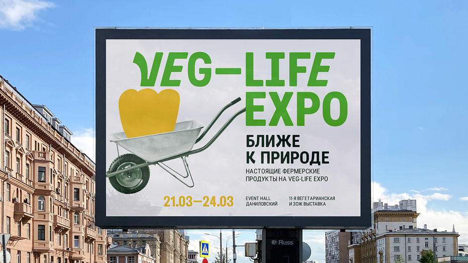
Nikita Gavrilov
Conceptual Branding for Veg-Life Expo
Veg-Life Expo is a vegetarian and healthy living exhibition which is held in Moscow twice a year, with more than a hundred companies from Russia exhibiting there. You can see and taste various products made from plant-based ingredients, along with organic cosmetics, household products and clothing.
Natalia Radnaeva
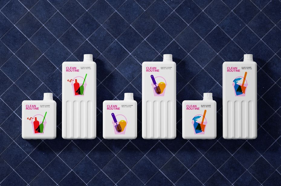
Packaging Design for Clean Routine Cleaning Products
Clean Routine is a brand of cleaning products which helps people keep their home looking its best on a daily basis. Routine can be bright and colourful. Сolour coding makes it easy to find the right product for the job. The designer uses simple and clear images and typography to highlight the straightforward process of cleaning. The floor cleaner is red and green, sanitary cleaner is purple and yellow, and the glass cleaner is blue and orange. The graphical execution is attractive to wide audience and makes the product stand out on the shelves.
Eugenia Kudrinskaya
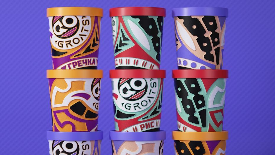
Student Concept for Quick-Cooking Cereals GO GROATS
GO GROATS are instant cereals for athletes. The cup design is embossed, allowing you to hold it in your hand without getting burned.
The design of the cups is based on the treads on sneaker soles, which emphasises the metaphor of “a snack on the go”.
Valeria Obrazkova
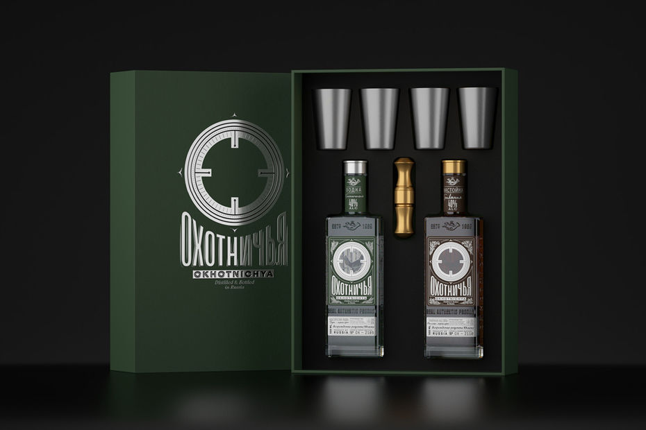
Student Packaging Design Concept for a Series of Products for the Okhotnichya Brand
The mission of the brand is to revive an archival recipe from the 20th century.
After researching the history of vodka and its target audience, the designer created a unique bottle for the brand, as well as designing a label, gift set and other souvenir products. The metaphor is based on the idea of a rifle sight because a good rifle sight is the key to a successful hunting expedition.
On the back of the bottle, there is an illustration of a grouse. On the front label, there is a cut-out in the shape of a sight and when the consumer picks up the package he can aim at the bird.

Elizaveta Starodynova
Drum School for Children Branding and Promotion
The project is about a design for children’s drum school. Large typography and illustrations create a kid-friendly atmosphere. The font is printed from the modules on paper, and watercolor illustrations have been made to complement the font composition. As a result of these simple forms, the atmosphere of musical instruments is conveyed. You feel as if you are entering the hall: noisy, merry, with claps, and loud drum beats.
Evgenia Berezhnaya
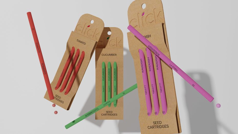
Concept for Just Click Seed Planter
Just Click is a reusable technological device made for people who want to plant seeds. Seeds come in all shapes and sizes. There are fewer difficulties with larger seeds - you can easily pick them up them one by one and plant them. On the other hand, smaller seeds are easy to lose, they stick to your hands and are harder to plant in the ground. Just Click easily solves this problem — the seeds are loaded into the device that you stick into the ground and with one click (similar to the click of a pen) the seed is pushed into the soil. This way, you can also plant the seeds without getting your hands dirty.
Bronze awards
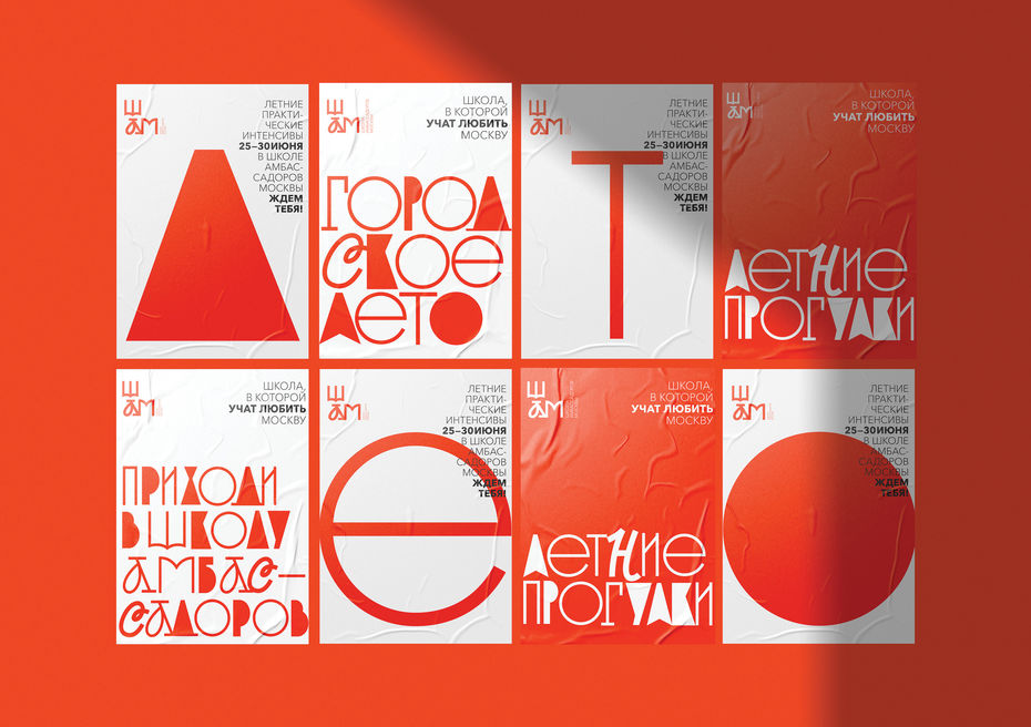
Tatiana Dunaeva
The School of Ambassadors of Moscow Branding Concept Design
The School of Ambassadors of Moscow is a project carried out according to a HSE University brief. The School creates an opportunity for Muscovites to gain the necessary expert skills to engage in travel design – to transform their personal knowledge into interesting stories.
While working on the product identity, the designer chose a typographic solution based on the principle of typographic eclecticism: an Old Russian font alternating with cursive fonts and other recognizable fonts of the avant-garde artist Sergey Chekhonin combine to form a unique alphabet.
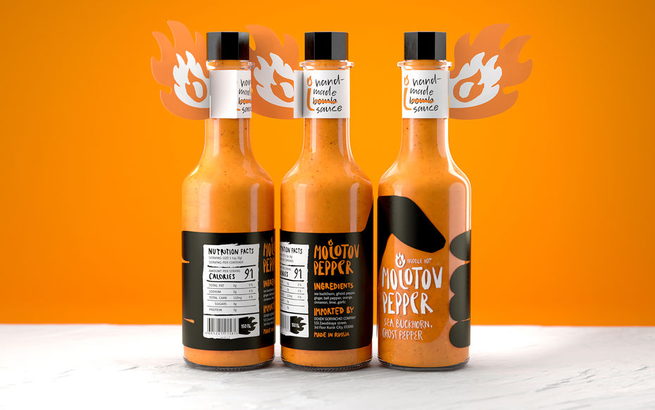
Nikita Gavrilov
Student Packaging Design Concept for Molotov Pepper Handmade Hot Sauces
These handmade sauces made from the spiciest types of peppers are created for people who are looking for new extreme sensations in food. The bottle design resembles a Molotov cocktail in the hand of a person ready to throw it. To convey the natural and rebellious essence of the sauce, the logo and typography are in an expressive handwritten font. The letter “L” in the logo serves as an indicator of spiciness – the higher the Scoville rating, the more the pepper burns. This also functions as a monogram and it is located on the lid and neсkhanger.
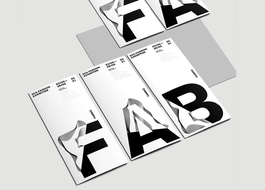
Tatiana Dunaeva
Sustainable Fashion Exhibition Design Concept
The main task in developing the exhibition’s identity was to create a unique typographic style. The font used in the design reflects one of the exhibition main messages – a call to reduce waste in fashion, and instead focus on sustainable consumption. The graphical solution is based on the Akzidenz-Grotesk font. Tatiana created wavy letters, which she then combined with letters from the usual font set using the cross-type method. Thus, an original font resembling fabric folds was created.
Anna Mosevnina
Concept Visual Identity for the Center of Slavic Cultures
The Center of Slavic Cultures is a library that organizes entertainment, educational and professional events and specializes in Slavic cultures. The visual identity is based on a combination of ethnic illustrations based on traditional slavic wooden architecture and the “Slavic” family of fonts designed specifically as part of the project.
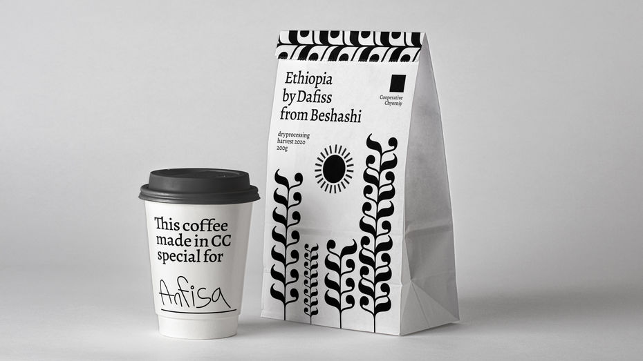
Alexandr Korshenyuk
Cooperative Chyorniy Coffee House Brand Identity Concept
Cooperative Chyorniy (Cooperative Black) is a Moscow specialty coffee shop. In February 2021, they organised a competition for new packaging concept for their beans, and at the same time, the School of Design asked Alexandr to create an identity for the company based only on the Bodoni font. Alexandr developed the identity and packaging design for the Cooperative Chyorniy based on the letter K from the Bodoni range. No colors other than black and white were used, since the Chyorniy Сooperative uses only a black and white palette.
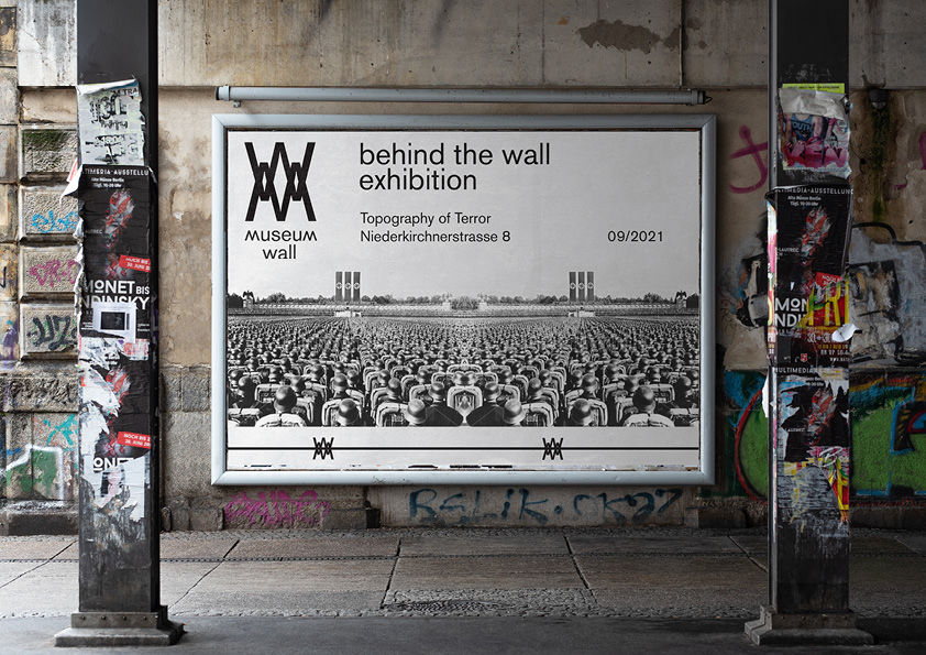
Polina Sergeeva
Student Concept for Museum Wall, Behind the Wall Exhibition
The Museum Wall identity for the ‘Behind the Wall’ exhibition is based on typography in the form of barbed wire. The identity of the exhibition is dedicated to the history of people who were sent to concentration camps during World War II. Many photographers risked their lives to capture the horror of what was happening behind the wall. The logo for the exhibition of the Wall museum was designed using the typography of the first letters M and W, which were overlaid to take the form of barbed wire. The photographers’ works presented at the exhibition encourage people to reject violence and war. The project was prepared for the day of remembrance of the victory over fascism.
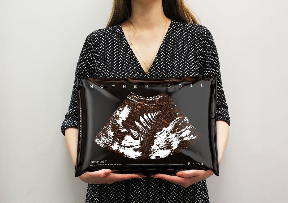
Polina Sergeeva
Student Packaging Design Concept for Mother Soil for Planting
‘Mother Soil’ represents a line of soils for planting. The Earth is considered to be the mother of all living beings and plants, and the source of fertility. Good soil, like the mother’s womb, gives life to plants. Many plant lovers treat them as their ‘children’ and give them names. Many of them call themselves ‘plant parents’.
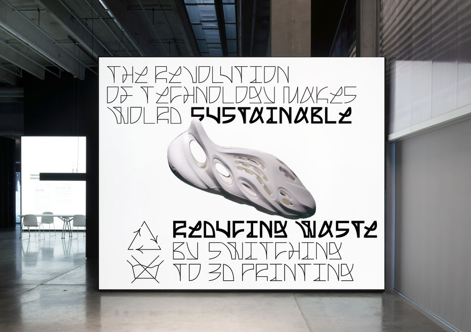
Natalia Radnaeva
Identity for 3D Printing Fashion Exhibition
‘Made in Printer’ is an exhibition about fashion that is produced using 3D printing. This technology relates to sustainable development, helping to design clothes from recycled plastic. The custom font is inspired by 3D printing technology, combining industrial (digital) and plastic (textile) parts of the process. As a result, the font gives the impression of something both technological and as flexible as fabric. The words on the posters describe the clothing composition: 100% plastic, ABS plastic, PLA, Polycarbonate, etc. We can observe this font on different types of media: posters, merch, billboards, as well as the interior and exterior of the exhibition.

Gosha Chubukin
‘Special One’ Soda Packaging
‘Special One’ soda is a social project focused on reducing the stigma of mental disorders among young people. Five tastes correspond to the five most common personality disorders. On the back of the can you can read general information about the illness and learn about the first symptoms. The packaging also features augmented reality — if you point the camera at the front of the can, an animation will show you an interesting fact about the illness.
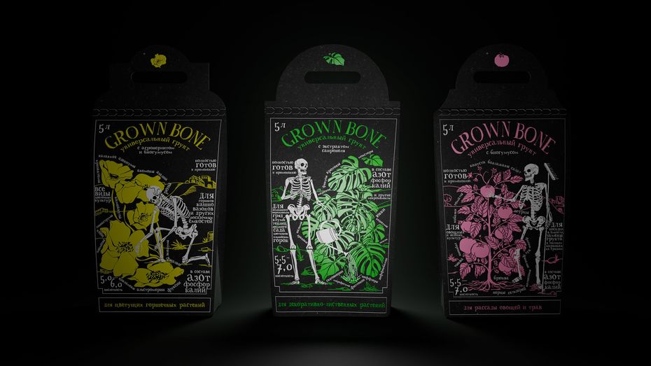
Svetlana Korotkikh
Grown Bone Concept for an Unusual Brand of Topsoil
Soil for plants is more than just living environment, and this soil packaging is more than just packaging. Soil is a vital element that plants cannot survive without, and consists of both of organic and non-organic elements, which creates a contrast between life and death. These days people have become more mindful, and meditation serves as a tool to reflect on life and death. Some studies have shown that growing plants has positive psychological effects and can be used as a meditative activity, reflecting the philosophy behind Grownbone – a new brand of potting soil.
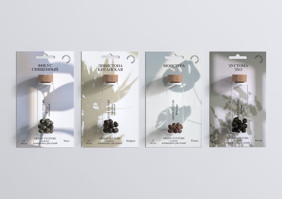
Natalia Radnaeva
Green Culture Seed of Indoor Plants
For our target audience, indoor plants are a part of their home decor. Therefore, houseplants should complement the interior. When you have plants at home they tend to cast shadows. These shadows and different lighting (morning, afternoon, evening) make the room look lively and stylish.
Jury Mentions
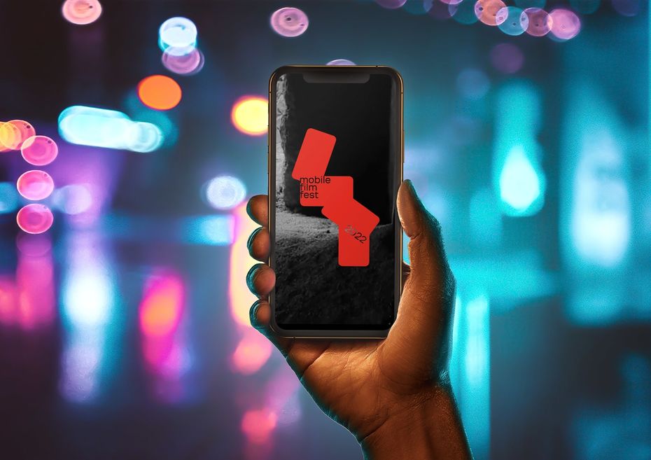
Alena Strom
Identity for the Mobile Film Fest 2022
Mobile film has given young filmmakers the opportunity to stand out from the crowd. Today, when almost all media is at risk of censorship, amateur filmmakers are able to uncover forbidden topics and help the heroes of their work speak out. Mobile Film Fest helps filmmakers to express themselves without needing professional equipment.
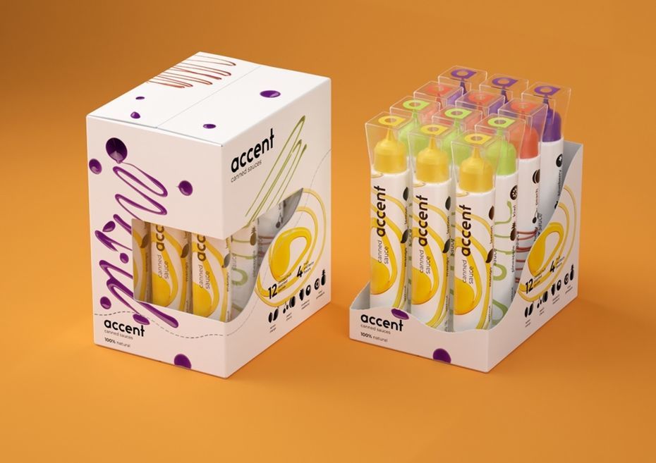
Irina Ushchekina
Accent Natural Sauces Packaging Design Concept
Accent is a brand that specializes in producing natural sauces without added sugar for elegant food presentation. The visual metaphor for the brand is ‘’Sauces as an artist’s tool’’ . Accent sauces mean anyone can add an aesthetic accent to their dishes via creative cooking. The brand line features 3 types of packaging, with a set of 3, 8 and 12 pieces for individual sale.
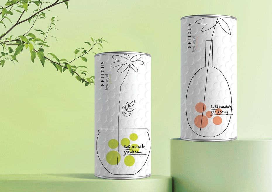
Tatiana Dunaeva
Hydrogel for Sustainable Gardening Concept
Hydrogel is high-tech product for the 21st century, which can be used independently as substrate for growing plants. It absorbs more than100-200 times more its own weight in water, and is able to absorb and give off liquid fertilizers.
Evgeny Razumov, lecturer at HSE Art and Design School said, ‘The World Brand Design Society is a relatively new festival platform for us. Being among the winners there is just as prestigious as succeeding in the more well-known Pentawards or Dieline competitions. I am delighted for the students whose names have regularly appeared there here over the past few years. Participating in these type of contests is very important, not only for the prestige, but in terms of future careers. The students get recognized both in the local and international design community, and are then snapped up by well-known agencies and studios, with potential customers paying particular attention to their works. And of course, being a part of the history of the development of the creative industries is also very important.’
See also:

ADCR Awards: HSE University Wins in Ten Nominations
In early October, the award ceremony for the winners of ADCR Awards, a Russian professional competition in creativity, design and advertising, took place. This year, all the prizes in the Graphic Design/Product Design category were taken by HSE students. Additionally, the HSE Art and Design School has once again been named the School of the Year, and Leonid Slavin has been recognised as the tutor of the year. In 2024, participants submitted a record 649 works to the competition, of which 84 received awards in various categories.
GRADUATION'24: HSE Art and Design School at the Zaryadye Exhibition
On October 11, 2024, the third exhibition GRADUATION'24 opened at the Parking Gallery of Zaryadye Park. More than 200 promising artists from 22 Moscow institutions are participating in the event. The exhibition features various works from modern painting to computer games created by graduates of different tracks of HSE Art and Design School.
‘Intriguing Collaboration’: HSE Student Works Displayed at Yandex Museum
Last year, HSE University and the team at Yandex Museum launched their first joint competition, ‘New Life of Familiar Things,’ involving students from various fields at the HSE Art and Design School. The winners' works are now displayed at the Yandex Museum. The HSE News Service interviewed the winners about their innovative design and implementation.
‘New Life of Familiar Things’: Exhibition of Student Projects at Yandex Museum
On July 3, 2024, the Yandex Museum on Paveletskaya in collaboration with the HSE Art and Design School opened an exhibition showcasing familiar objects that have been given new forms, functions, and meanings. The exhibition features the projects of finalists from a competition organised by the HSE Art and Design School and the Yandex Museum. Visitors can explore works created by young designers and talented students of the HSE Art and Design School, who have reimagined familiar objects in the context ofmodern life.
Season Eight of HSE CREATIVE OPEN Competition Begins
HSE CREATIVE OPEN international online competition of the HSE Art and Design School opens the summer season featuring new categories: ‘Visual Research,’ ‘Game Design,’ ‘Motion Design,’ ‘Poster,’ and ‘Digital Product.’
HSE ART GALLERY 2.0: Relaunch and New Space at the Winzavod
HSE ART GALLERY, which was established in 2018, is launching a new exhibition area. This second gallery will be in Winzavod, one of the largest private centres for contemporary art in Russia. The art space on Paveletskaya will become a place for implementing commercial projects and housing exhibitions by HSE Art and Design students and graduates.
HSE University and Pobeda Airlines Launch Joint Competition
HSE Art and Design School, in collaboration with the Pobeda Airlines, has announced the start of a competition to create a new uniform design for flight attendants and representatives of the airline. Young professional designers, as well as students over 18 years old studying at Russian universities in full-time and part-time programmes in the field of ‘Design and Fashion,’ will have the opportunity to showcase their talent.
Exhibition by HSE Art and Design School Students Now Open at Fabrika Centre
The Fabrika Centre for Creative Industries is hosting a graduation exhibition by bachelor’s students of Contemporary Art at the HSE Art and Design School. In the exhibition titled ‘Freedom of Absurdity’, the early-career artists present their interpretations of melancholy. The exhibition is open to visitors until April 21, 2024, and admission is free of charge.
‘The Form of a Building Plays a Supportive Role; the Main Thing is Its Content’
Environmental design shapes the reality around us. It is the appearance of spaces, buildings, and objects that surround us. What is happening in this field today? What awaits us in the future? And how do we prepare for it? The HSE News Service discussed these and many other topics with Boris Bernaskoni, Head of Environmental Design Studies at the HSE Art and Design School.
Still the Best: HSE Art and Design School at the World Brand Design Society
HSE Art and Design students, graduates, and curators have been participating in the World Brand Design Society international competition for several years. The winter of 2023/24 was no exception—several projects won in various categories.